
One good thing though is that I have lots of scraps from all the pieces I cut from the original round blocks. And, I already have a plan of what to do with some of them, so stay tuned..........
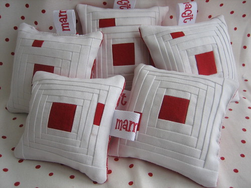
Then, I also made a few more pin cushions. Several of my friends just flipped over that simple red and white one, and I wasn't about to give them mine, so I HAD to make some more:

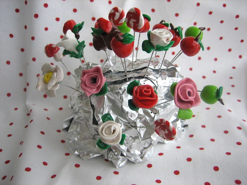
Then.....(can you tell it was a boring, snowy weekend here???) I thought I'd work on more pin toppers.

I invested in some SculpeyIII instead of that Fimo polymer clay I was using and it's so much easier to use. I also got some longer pins today, and I think (yes, I'm close to being certain) that I am going into business with these. I thought that they might be fun to sell at my LQS. I'll make a giant pincushion and it could be at the counter where the cash register is filled with pretty pin toppers. How fun! (Too bad the owner doesn't know this yet, huh? LOL) I will do lots more styles.....I was just practicing with the ones pictured. I'm thinking $5.00 would be a fair price to charge depending upon the difficulty. I also bought some small boxes so if any of you have a hankering for an apple or two, let me know.
Never a dull moment around here. I needed a new project you know (like a hole in my head).........eikes! I wish this brain of mine would slow down sometimes............

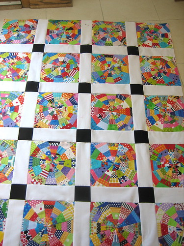
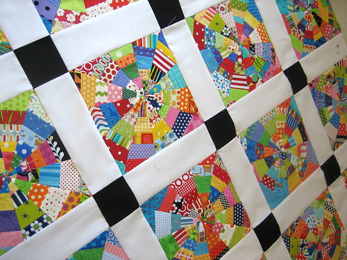
The blocks are incredible - I think you are right that both the width of the sashing along with the size of the black square distract from the beauty of the blocks. I know it will be great when you're finished.
ReplyDeleteI love those blocks...but I think the sashing is too overpowering..It needs to be half or 1/3 the size..
ReplyDeleteI agree with you that the sashing is a tad too wide but I think the bigger issue is the black setting squares. They may be better smaller but what do you think they would look like in Blue or red or Lime Green - personally I would give it a shot 'cause your blocks are SO beautiful and were clearly a lot of work. After all that you should end up with a quilt that you LOVE!! I'm just sayin' :0)
ReplyDeleteThe black squares overwhelm the quilt. All you see is the black when you look at it. :(
ReplyDeleteMaybe smaller sashing, but the black ... has. to. go.
I agree. The black squares are the main culprit. The sashing is a bit wide, but I think it would work with different colored setting squares. Beautiful otherwise!
ReplyDeleteThose pins are sooooooo cute! I'm sure your LQS will love to sell them for you.
ReplyDeleteNarrow your sashing - I like the black squares. Then a black/white check outer border with a red dotty binding to tie it all in. But you seem to work it all out anyway.
ReplyDeleteMaybe a black or black and white border or binding to frame it and pull it together. I like it though.
ReplyDeleteFor me the black squares pop, which makes the amazing kaleidescope squares recede...
ReplyDeletedarlin' mama C, this is the first time that you have ever made anything that I did NOT like - the wide white sashing and the blunt black boxes completely draw the eyes away from the most beautiful squares ever - the piecework is completely lost
ReplyDeletepins are too stinkin' cute - you will be burning the midnight oil making those for the LQS
What type of "longer pins" do you use for your decorative pins? They are awesome!!
ReplyDeleteBrenda (no blog)
I think your gut is right. The wider sashing and black squares are fighting a little too hard to steal the attention from your gorgeous blocks.
ReplyDeleteI think the black squares are asking for a pop of color.. a button?? something. As colorful as the blocks are.. they are being overtaken by the black square.
ReplyDeleteYou pinned it dear heart...never a dull moment. Your lap quilt well I just love that...beautiful. colorful, full of life...bright enough to melt the snow lol...and the pin cushions..well of course I love those too and the pins...well what can I say..you are one big pin in my behind...lol. ( define...you make me want to go go go )
ReplyDeleteI agree with the others. The sashing should be narrower and the black might work better in a different colour.
ReplyDeleteAs for the pins, those are sooo cute!
Carol-
ReplyDeleteI agree with the other comments about the sashing and the black squares - maybe skinny sashing in a color that compliments the squares?
LOVE the pins... adorable!
Your devoted follower,
Lisa
I think it's the black-- it's detracting from the awesomeness that is those blocks! Can't wait to see where you take it!
ReplyDeleteQuilt it with a bright muilticolor thread like star 'gum balls' and put flowers in the black squares and butterflies and leaves in the sashings
ReplyDeleteJust a suggestion.
Mary Ann
Quilt it with a bright muilticolor thread like star 'gum balls' and put flowers in the black squares and butterflies and leaves in the sashings
ReplyDeleteJust a suggestion.
Mary Ann
You are a new blog for me and I'm loving it! You create such fun and happy pieces.
ReplyDeleteThe quilt is gorgeous....I love the scrappy blocks. Your gut is right about the sashing & black...I'd change it now before you get it quilted cuz who wants to pick out quilting stitches? Ugh.
Good work on the straight pins.
Awesome job on all your projects! I truly love the colors in the quilt.
ReplyDeleteHave a great week. :)
I have to say I like it like it is... the sashing and black blocks adds depth to the blaocks because they look like a optical illusion.
ReplyDeleteLove those pins too!!! and who wouldn't like those great pin cushions!
It kind of reminds me of a kaleidascope. I feel that it needs more color on the sashings. Besides that I find it a very delightful quilt. Bright and Cheery.
ReplyDeleteIMHO, I feel the black squares are not quite gelling with the rest of the quilt. Maybe plain sashing without the black might have made a more pleasing result?
ReplyDeleteI think I would narrow that sashing too and I am not overly fond of the black either but maybe if it was smaller it might not be so over powering , I love the blocks though, just awesome !
ReplyDeleteThis is great stuff! Your quilt is wonderful but I agree that the sashing and black cornerstones distract from the beauty. Love, love, love the pincushions and your pins tops are gorgeous!
ReplyDeleteLove those pins! Absolutely darling. Etsy???
ReplyDeleteI would VERY much like a pin topper of my own!
ReplyDeleteAlso, will you share where you got your great personalized labels that I see attached to your pin cushions?
Quilt the sashing with a bold, bright variegated thread maybe diagonally or zigzagging across. I think it will be great.
ReplyDeleteJust wondering if you know someone who is going to graduate or get married. It looks like a perfect quilt for writing messages in those perfect white canvas strips...,i.e...Hope your wedding is as full of color as this beautiful quilt and may it bring you warmth and glad tidings!
ReplyDeleteMaybe you could tone down the black suares by appliquing a spot of color on them.
ReplyDeleteI adore the blocks, but like most of the other commenters the black is too overwhelming for me...I'm sure you'll figure it out. it's hard to take things apart. i want those beautiful blocks to be the stars. i think i'd take out the black. good luck finding a solution!
ReplyDeleteI'm with the others on how the white and black are overwhelming the fabulous piecing, but I know you can quilt those parts fabulously and the whole thing will sing.
ReplyDeleteinteresting, i seem to disagree with the general flow of comments (interesting, tho NOT surprising).
ReplyDeleteI kinda like the white sashing and black squares. It gives the eye a rest from the gloriously bright colors of the pinwheels. But, whadda, I know? nada....
and the pins?! oh YEAH.... i would love to buy a couple....ok, MORE than, a couple.... 5 or 10? (no, sincerely!)
hugZ,
annie
rubyslipperz106.blogspot
I think that everyone else has expressed their opinion on your sashing dilemma & I'm quite connfident that you will work this out as only you can.
ReplyDeleteI LOVE the pins!! Your talent is really shining through with those cuties. What eye candy!!!
Kim
Yes it does seem that everyone has an opinion and of course mind is usually the minority one but I like the sashing and the black cornerstone. Now if this was my quilt (and boy do I wish it was) I quilt it in a bright variegated thread in an all over pattern and the quiting will just pop in those white and black areas - IMHO.
ReplyDeleteYour pins are too stinking cute - lately I'm on a pincushion kick and I'd love to have some sweet pins like these to adorn them.
Happy stitching-
New to quilting so am looking for blogs for inspiration! And WOW this is very beautiful! I'd go with maybe a different bright colored solid button on each black square.
ReplyDeleteI really like your quilt top!!!!! Makes me want to make one too. Hold your judgement until after it's quilted...quilting sure makes it look different! (if you still don't like it I could take it off your hands!! LOL)
ReplyDeleteI love the quilt if the focus is on the sashing and the black corner stones, that is what pops out. Love your blog!
ReplyDeleteBrenda C.
Oh my goodness! How could you not like that quilt--I'm wiping up the drool over here! This just makes my eyes happy. Tell you what, I'll store it for you... ;)
ReplyDeleteI quite like your quilt, but I would put an extra border made with all your colorful scraps and that will then put the white sashing in the background and bring color center stage.I hope you like it once it's quilted.
ReplyDeleteI'd swap the large black squares for a square in square done all scrappy in the same colors in the spider web blocks. Keep the eyes focused on the great part of the quilt (and as many people already noted, the black is overpowering).
ReplyDeleteJMHO :-)